Visualize fitted growth curves, derivatives, and growth statistics#
This tutorial demonstrates how to visualize fitted growth curves, derivatives, and growth statistics.
The workflow includes:
Generating growth data and fitting models
Plotting mechanistic model fits
Plotting phenomenological model fits
Visualizing phase boundary methods
Plotting derivatives (μ and dOD/dt)
Comparing growth statistics across models
For a notebook focused on the analysis workflow only (without plotting),
see analysis.ipynb (Fit growth models and extract
growth statistics)
import numpy as np
import pandas as pd
import growthcurves as gc
from growthcurves.inference import compare_methods
from growthcurves.plot import plot_growth_stats_comparison
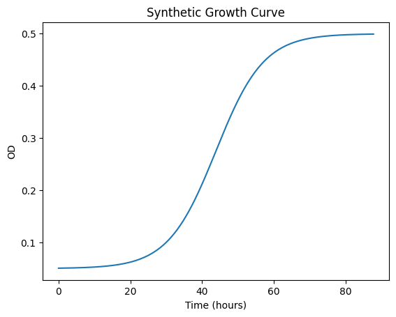
Generate synthetic data#
This cell generates synthetic growth data from a clean logistic function.
Fit and compare all methods using the
compare_methods function,
then filter to only
phenomenological and non-parametric models for comparison.
Generated 440 data points over 87.8 hours
OD range: 0.051 to 0.499
Fitted 6 phenomenological models
fit_sliding_window received unused kwargs: {'spline': 0.2}
Mechanistic Models - Fit Visualization#
Example: Plot phenomenological Richards model
Phenomenological Models - Growth Statistics Comparison#
Compare growth statistics across all phenomenological methods (parametric and non-parametric).
fit_sliding_window received unused kwargs: {'spline': 0.2}
| mu_max | doubling_time | time_at_umax | exp_phase_start | exp_phase_end | model_rmse | fit_method | |
|---|---|---|---|---|---|---|---|
| phenom_logistic | 0.079979 | 8.666571 | 36.246092 | 21.923804 | 50.658696 | 0.000817 | model_fitting_phenom_logistic |
| phenom_gompertz | 0.092212 | 7.516896 | 33.782766 | 25.07681 | 48.666283 | 0.005205 | model_fitting_phenom_gompertz |
| phenom_gompertz_modified | 0.089873 | 7.71256 | 33.430862 | 23.467609 | 48.628298 | 0.00408 | model_fitting_phenom_gompertz_modified |
| phenom_richards | 0.078659 | 8.812088 | 36.597996 | 21.241111 | 50.891908 | 0.000506 | model_fitting_phenom_richards |
| spline | 0.077924 | 8.895163 | 36.178894 | 21.572282 | 50.946358 | 0.0 | model_fitting_spline |
| sliding_window | 0.077894 | 8.898575 | 36.2 | 21.56668 | 50.952021 | 0.000005 | model_fitting_sliding_window |
Phase Boundary Detection Methods#
Visualize how different phase boundary detection methods affect exponential phase identification.
Two methods are available:
1. Threshold Method#
Tracks instantaneous specific growth rate μ(t)
Phase starts when μ exceeds a fraction of μ_max (default: 15%)
Phase ends when μ drops below the threshold
2. Tangent Method#
Constructs a tangent line in log space at maximum growth rate
Extends tangent to intersect baseline and plateau
Generate the phase boundary comparison#
see plots
Derivative Visualizations#
Visualize growth curves and their derivatives:
Specific growth rate (μ): d(ln N)/dt - the per capita growth rate
First derivative (dOD/dt): The rate of change of OD